New Split Pane and more, Ionic 2.2.0 is out!
You thought the grid was great? This isn’t even our final form.
Why hello you amazing people, we’ve got some exciting updates and news to share from the front lines of Ionic development.
Ionic 2.2.0, the best Ionic yet ?
Keeping the momentum going, we’re happy to announce that Ionic 2.2.0 is out. This includes some bug fixes, as well as two key features:
- Split Pane component
- Update to Angular 2.4.8 support
Now one of these features is a lot cooler than the other…so let’s go over the Split Pane.
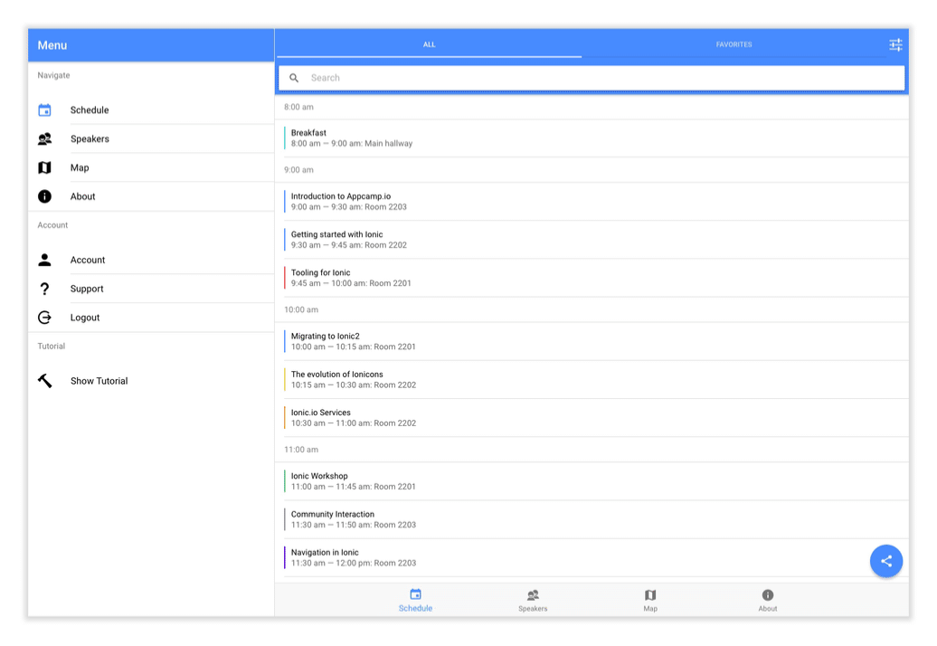
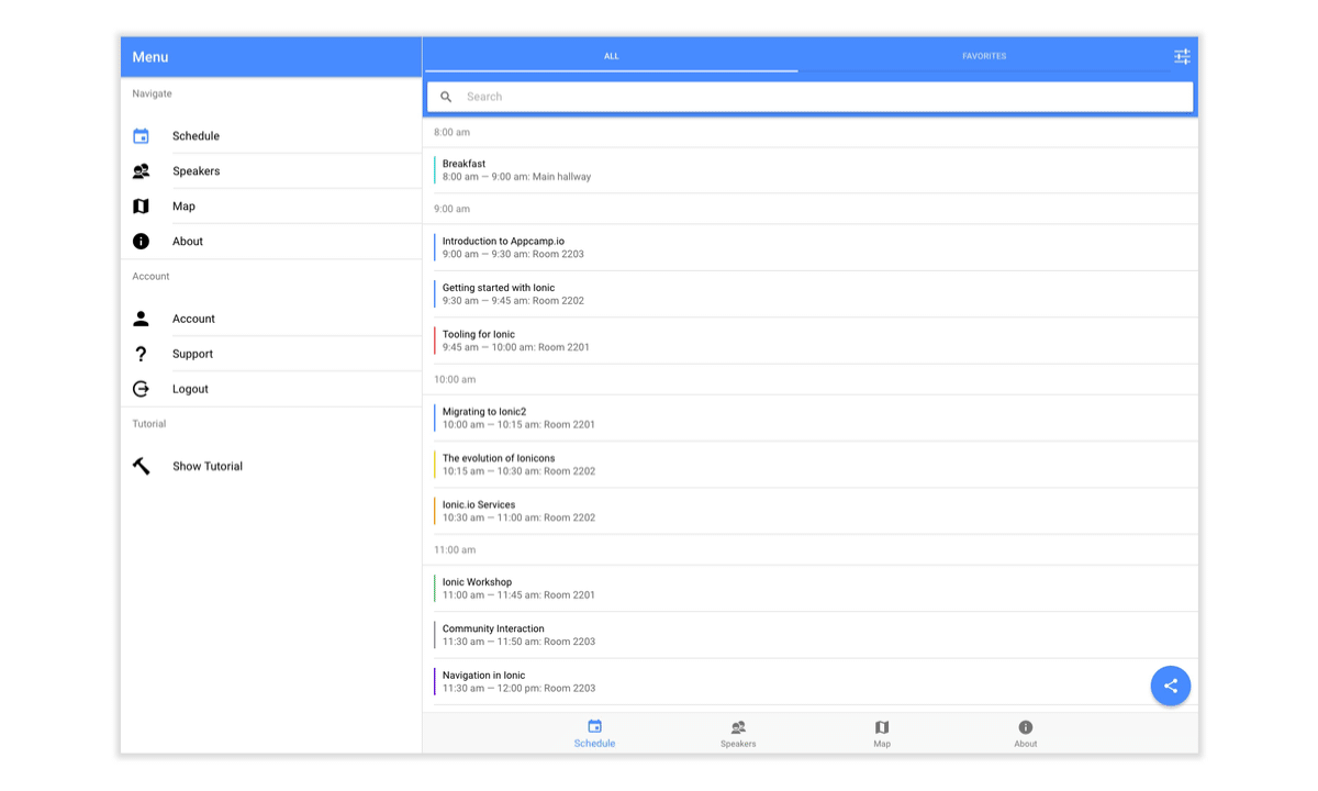
Split Pane for responsive apps
One of the most requested features when we started working on Ionic 2.x was split pane, or adding the ability to create two views on larger screen sizes. Now this was available in Ionic 1.x as expose-aside-when, but was heavily tied to the ion-side-menu. This made it really limited in terms of functionality. With Split Pane in 2.x, we’ve rethought how this should be done to be ‘automatic’ enough, but also not limit developers to Menus.
Now if you want to add a Split Pane to your app, it’s as simple as wrapping your root component.
<ion-split-pane>
  <ion-menu [content]="myNav"></ion-menu>
  <ion-nav #myNav main><ion-nav>
</ion-split-pane>
In this example we’re using a Menu, but this could be anything.
The only requirement for Split Pane is that a component has an attribute of main.
The main attribute is just a way for Split Pane to know what is going to be the “main” content, and what element is going to be the “side” content.
Other than that, the Split Pane “just works”!
By default the Split Pane will be hidden until the viewport reaches the md breakpoint, which is (min-width: 768px).
This can be customized by setting the [when] property.
<ion-split-pane when="xl">
  <ion-menu [content]="myNav"></ion-menu>
  <ion-nav #myNav main><ion-nav>
</ion-split-pane>
There are multiple built-in breakpoints that can be set, so be sure to check out the Split Pane documentation to read more.
Nav-inception
While just showing and hiding content on the side is cool, we can take this a step further and add nested navigation to the side content.
If you’ve ever used iOS’s mail app on an iPad, this is quite familiar.
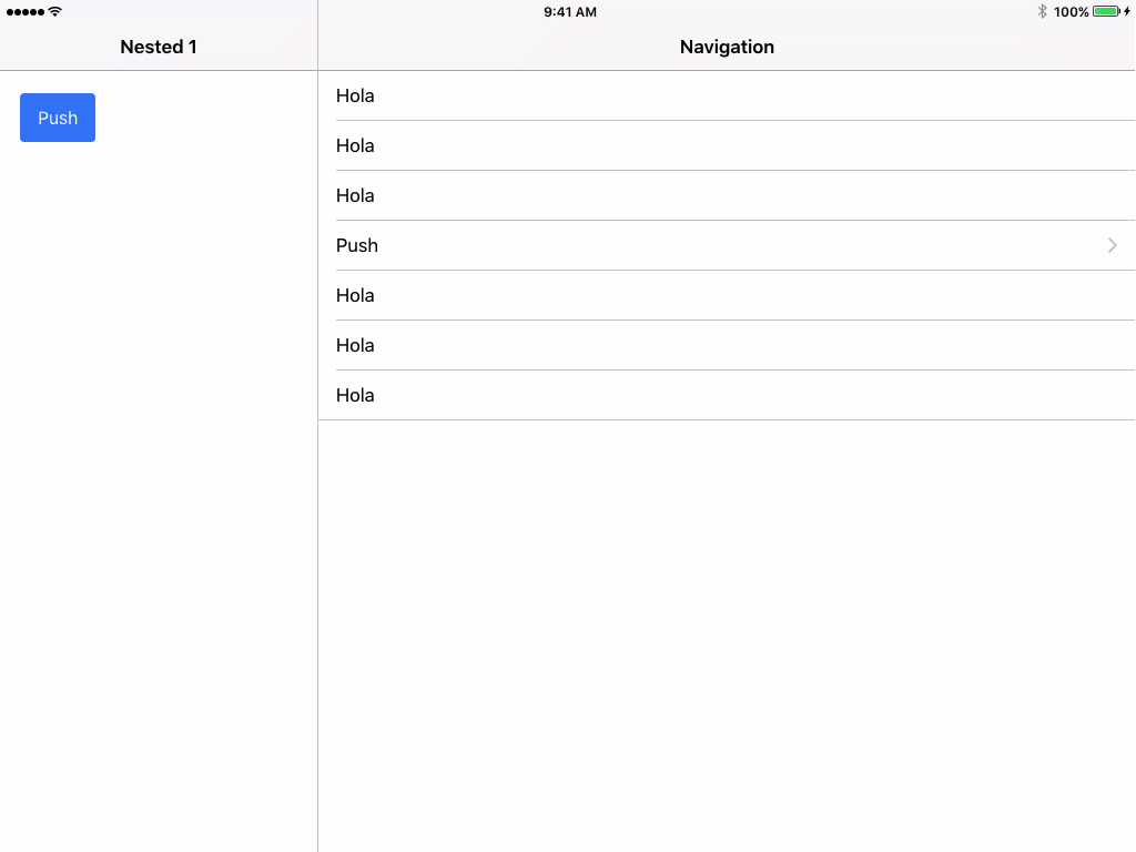
Each component has its own ion-nav and can navigate independently from one another. This nesting of navigations allow for much more complex and sophisticated apps to be created, and is something we’re very excited about.
What’s next
The Split Pane is a major step forward into creating new apps that can feel at home on larger devices like tablets and traditional desktops.
We’re super excited about it and can’t wait to see what kind of apps you can build with it!
So what’s next? So much more! We have a lot more in the works in terms of desktop support, so be sure to stay tuned.
Also make sure to take a look at our Desktop development guide for tips on scaling your app to work on large displays.