The New Datetime Component In Ionic
What’s that? There’s a new Datetime component in Ionic? Well, not entirely, but given the massive overhaul it went through, you wouldn’t be mistaken for thinking that. With version 6.0.0 of Ionic, we spent a lot of time updating the Datetime component based on feedback from the community. We also updated the component’s design to better match iOS/Material guidelines. This, however, has led to an influx of questions about the component and how developers could customize it to fit their needs. Let’s take a look at the component and start to understand how it works.
From Ionic v5 to v6
Before looking at what the new Datetime component is like, let’s view the v5 version first.
See the Pen
Ionic Core V5 Datetime by Mike Hartington (@mhartington)
on CodePen.0
The component was originally built with the idea that Ionic would control showing the overlay and handle display of the date/time, and the user would just have to click the Datetime to interact with it.
<ion-item>
  <ion-label position="stacked">MMMM YY</ion-label>
  <ion-datetime
    displayFormat="MMMM YY"
    min="1989-06-04"
    max="2004-08-23"
    value="1994-12-15T13:47:20.789"
  ></ion-datetime>
</ion-item>
While this was good for the most part, it did have a few limitations. The main limitation was that you couldn’t embed the component directly into your app. Users would always have to interact with the component through the overlay.
In addition, the visual design of the component started to feel dated. While this design was popular in older versions of iOS, Android and iOS had started to move away from it and towards a more complete calendar view. And to top it all off, it required JavaScript to scroll the columns, which was a huge hit to performance on lower end devices.
With all that in mind, a revamp was needed.
Into the Future
If you were to update your app to Ionic v6.0 and not make any changes, what you’d get for the new Datetime is something like this:
See the Pen
Ionic Core V6 Datetime: no changes by Mike Hartington (@mhartington)
on CodePen.0
Now, instead of being hidden away in an overlay, the component is shown inline. For the most part, everything “works,” but it is far from ideal. So let’s update things and take advantage of some new properties.
First off, let’s handle the layout, which is probably the most striking change. As the component can be shown inline now, we’re not recommending folks render it inside of an ion-item like before. Instead, we suggest using another new component, IonAccordion, to show and hide the Datetime. This is very similar to how iOS’s calendar app displays things.
To do this, we can modify our HTML like so:
<ion-list>
  <ion-accordion-group>
    <ion-accordion value="start">
      <ion-item slot="header">
        <ion-label>MMMM YY</ion-label>
        <ion-note slot="end" id="datetimeValue"></ion-note>
      </ion-item>
      <ion-datetime
        id="datetime"
        slot="content"
        displayFormat="MMMM YY"
        min="1989-06-04"
        max="2004-08-23"
        value="1994-12-15T13:47:20.789"
      ></ion-datetime>
    </ion-accordion>
  </ion-accordion-group>
</ion-list>
You can see this live below:
See the Pen
Ionic Core V6 Datetime: IonAccordion by Mike Hartington (@mhartington)
on CodePen.0
There’s a bit of JavaScript involved to work with the date information, but it’s not the point of the demo.
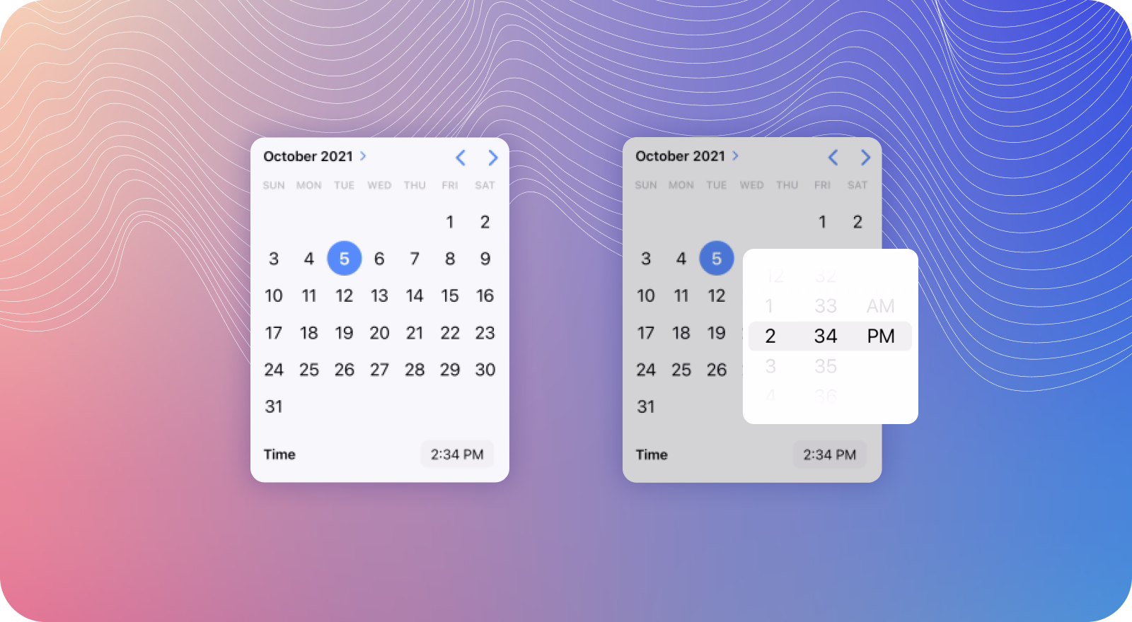
Another upgrade in the v6 Datetime component is the type of UI we display to the user. In the v5 example, all we showed a simple Month, Date, and Year picker, but now with v6 there’s an option to select the time. While this can be useful, in this situation we only need the calendar view.
To change this, we can use the new presentation property on Datetime. The presentation property allows you to customize exactly what you show the user by passing in different values. You could pass in date, date-time, month, month-year, time, time-date, or year. Since we only require the date and not the time, let’s change it to use date instead. This replaces the displayFormat property, which used the various short codes that could be easy to get wrong.
See the Pen
Ionic Core V6 Datetime: IonAccordion Presentation by Mike Hartington (@mhartington)
on CodePen.0
Inline or Overlays
While inline Datetime is great, there are some cases where displaying the component in an overlay would make for a better user experience. Thankfully, Datetime can be rendered easily in a modal thanks to the new inline overlay components. For example, if we wanted to modify our existing demo to use an inline modal, we can use the following HTML:
See the Pen
Ionic Core V6 Datetime: IonAccordion Modal by Mike Hartington (@mhartington)
on CodePen.0
<ion-content>
  <ion-list>
    <ion-item id="open-modal">
      <ion-label>MMMM YY</ion-label>
      <ion-note slot="end" id="datetimeValue"></ion-note>
    </ion-item>
    <ion-modal trigger="open-modal">
      <ion-content>
        <ion-datetime
          id="datetime"
          presentation="date"
          min="1989-06-04"
          max="2004-08-23"
          value="1994-12-15T13:47:20.789"
        ></ion-datetime>
      </ion-content>
    </ion-modal>
  </ion-list>
</ion-content>
Now when we click the ion-item, it will trigger the modal and show our Datetime component. This is supported in Angular, React, Vue, and vanilla JS.
Now if we wanted to show the Datetime in a popover, we can simply swap out the modal for an ion-popover and boom!
See the Pen
Ionic Core V6 Datetime: Popover by Mike Hartington (@mhartington)
on CodePen.0
<ion-list>
  <ion-item>
    <ion-label>Start Time</ion-label>
    <ion-note slot="end" id="datetimeValue"></ion-note>
    <ion-popover trigger="datetimeValue" show-backdrop="false">
      <ion-datetime
        id="datetime"
        presentation="time"
        min="1989-06-04"
        max="2004-08-23"
        value="1994-12-15T13:47:20.789"
      ></ion-datetime>
    </ion-popover>
  </ion-item>
</ion-list>
Wrapping Up
Datetime is one of those components that is so powerful and has so many use cases, it’s almost impossible to show all of them. But hopefully this blog post can at least demonstrate some of the cool things that are possible, especially with the new component features. So check out the new docs on Datetime and let us know how you’re using it today!