Announcing Ionic 5!

Today, I’m thrilled to announce Ionic Framework 5 (Magnesium)! 🎉
This release includes iOS 13 design updates, a brand new API for creating your own custom animations, revamped Ionicons, updated Ionic colors, new starter designs, improvements to component customization, and more!
All of these changes are made in the core of Ionic Framework, which also applies to our Angular, React, and Vue (beta) integrations. Yes, if you haven’t heard yet, we launched our official React support this past October!
Attend our upcoming live walkthrough of Ionic 5, hosted by the Ionic team. Register here
Easy Upgrade ⛵️
You may be concerned about the upgrade process due to the fact that this is a major version release, but fret not! When we migrated to follow the semantic versioning convention, we committed ourselves to publish a major release when any known incompatible API changes were introduced. So in this case, the major version just indicates that our public API has been updated. And because we now use Web Components, API changes are handled separately between our UI components and the JavaScript framework.
Long story short: for those on v4, this upgrade should be easy. Now, let’s dive in and see what’s new!
iOS Design 🍎
The largest change in this release is a massive design upgrade across our UI components. Apple recently released iOS 13, which updated the design of many components and thus warranted some updates to our own. Let’s check out some of the changes we made to match native iOS!
Segment
The iOS Segment design changed drastically from the previous iOS version. Prior to iOS 13, borders and a filled background were used to differentiate between checked and unchecked buttons. With the latest design update, a single indicator is now used to slide between the buttons, checking the one it ends on. This update includes a gesture that can be used to drag the indicator. Below is a comparison between Ionic 4 and Ionic 5.
Due to the nature of this update, there were some breaking changes introduced. Other than any updates related to the breaking changes, no changes need to be made to use the new Segment design. See the Segment documentation for usage information.
Header
iOS introduced the idea of a collapsible header and different sized titles in previous versions. In order to support this, we’ve introduced some properties that can easily be added to the header & title components to get shrinking large titles, small titles, and collapsible buttons.
Large Title
The large title in iOS collapses into a standard-sized title when the content scrolls beyond a certain point. It can also be used without any collapsing if desired.
In order to achieve this, the header needs to be added twice: a header with a standard title above the content, and a collapsible header with a large title inside of the content. In addition to being able to collapse the header, Buttons and a Searchbar inside of the collapsible header can also collapse. See the documentation on Collapsible Large Titles for usage information.
Small Title
The small title, also known as a header note, is generally used inside of a toolbar above another toolbar that contains a standard-sized title. In native apps, it is most often used in combination with Swipe to Close Modals. See the videos in the section below for a visual representation of the small title.
See the Title documentation for usage information.
Swipe to Close Modal
The Swipe to Close Modal is something often seen in iOS now. Instead of displaying a modal that covers the entire screen and requires the user to tap a button to close it, it will display a modal that is inset with the page behind it pushed back. This update also includes a gesture to drag the modal down to close it.
In order to enable a swipe to close modal, swipeToClose and presentingElement need to be passed upon modal creation. See the documentation on Swipeable Modals for more information.
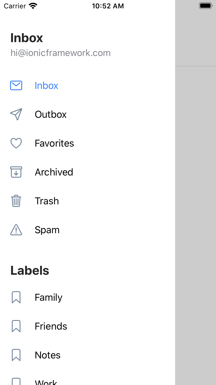
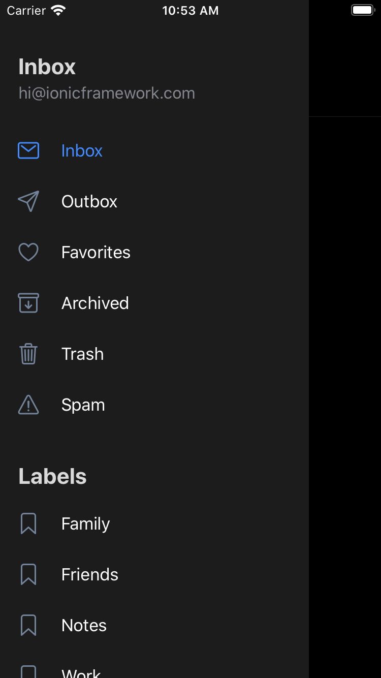
Menu Overlay Type
In prior versions of iOS, the side menu used a "reveal" type menu which pushed the main content over to reveal the menu. The new iOS design features a menu that will overlay the content with an updated animation.
No changes need to be made to take advantage of this new menu design. However, if you prefer the old way the menu type can be set back to "reveal".
Refresher
The Refresher pulling icon in iOS has been updated in native applications to be above a header with a large title. In addition to that, as you pull down on the content the spinner tick marks will gradually be displayed until the content is pulled down enough to where all ticks are seen and then it will begin to rotate. While updating the iOS refresher, we were able to use the same logic to completely redesign the Material Design refresher as well.
Other than moving the placement of the refresher, no changes are needed to use the new pull to refresh. See the Refresher documentation for usage information.
List Header
The lists in iOS have had many design changes. Most notably the List Header now takes on a more large and bold design. In previous versions, the List Header was uppercase and small and didn’t have the option for a bottom border. With the addition of the lines property on a List Header, it is now possible to add a border while matching the latest design.
Due to structural changes to support adding lines, it is recommended all text content inside of a List Header be wrapped in an <ion-label>. Additional information on this can be found in breaking changes.
Other than adding the label and lines if desired, no changes need to be made to enable the new design. See the List Header documentation for usage information. If the old design is desired, use custom CSS to achieve the previous look.
Ionic Animations 🕺
Ionic 5 introduces our brand new open source animations utility, Ionic Animations, that provides the tools developers need to build highly performant animations regardless of the framework they are using. Read more on the Ionic Animations blog.
Ionicons ❤️
Ionic 5 ships with the latest version of our free and open source icon library, Ionicons 5, which includes an all-new icon set!
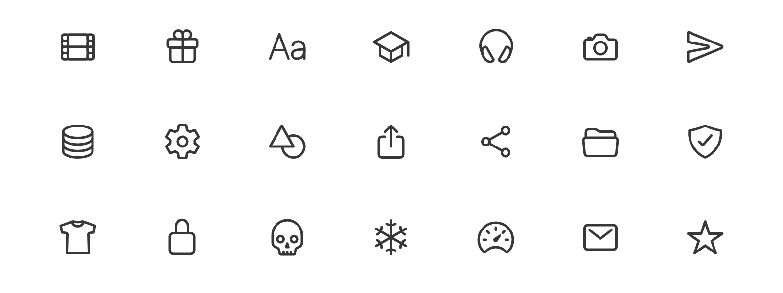
There will immediately be some differences noticed with this upgrade:
- One set of icons for both modes
- Icons come in three new variants: outline, fill (default), and sharp
- Icons will no longer switch between two different icons based on the mode
- The ability to set them per mode will still work, but the icon for each needs to be set using the
iosandmdproperties - There are still a handful of icons within Ionic that will automatically switch, such as the icon used in menu button, back button and the detail icon on items
- The icon font has been removed from Ionicons, but it does still contain an svg sprite if loading all icons on the same page is needed
For a list of all of the icons that were removed or renamed, see the Ionicons changelog document. To search through all of the newly added icons, check out the Ionicons site. Read more on our Ionicons 5 Announcement blog.
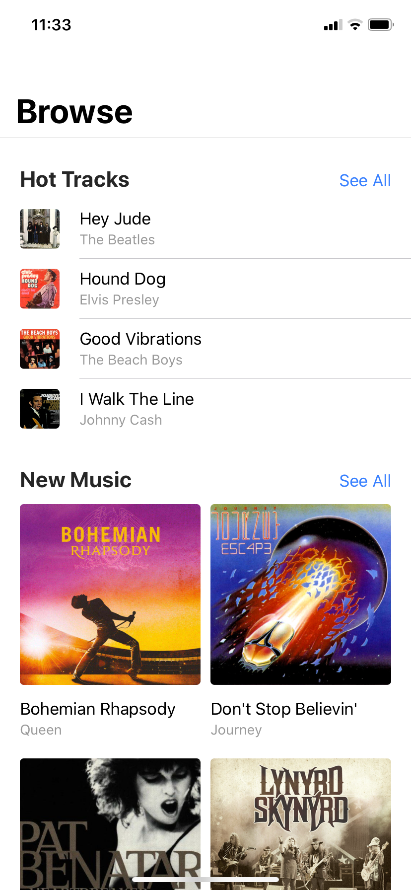
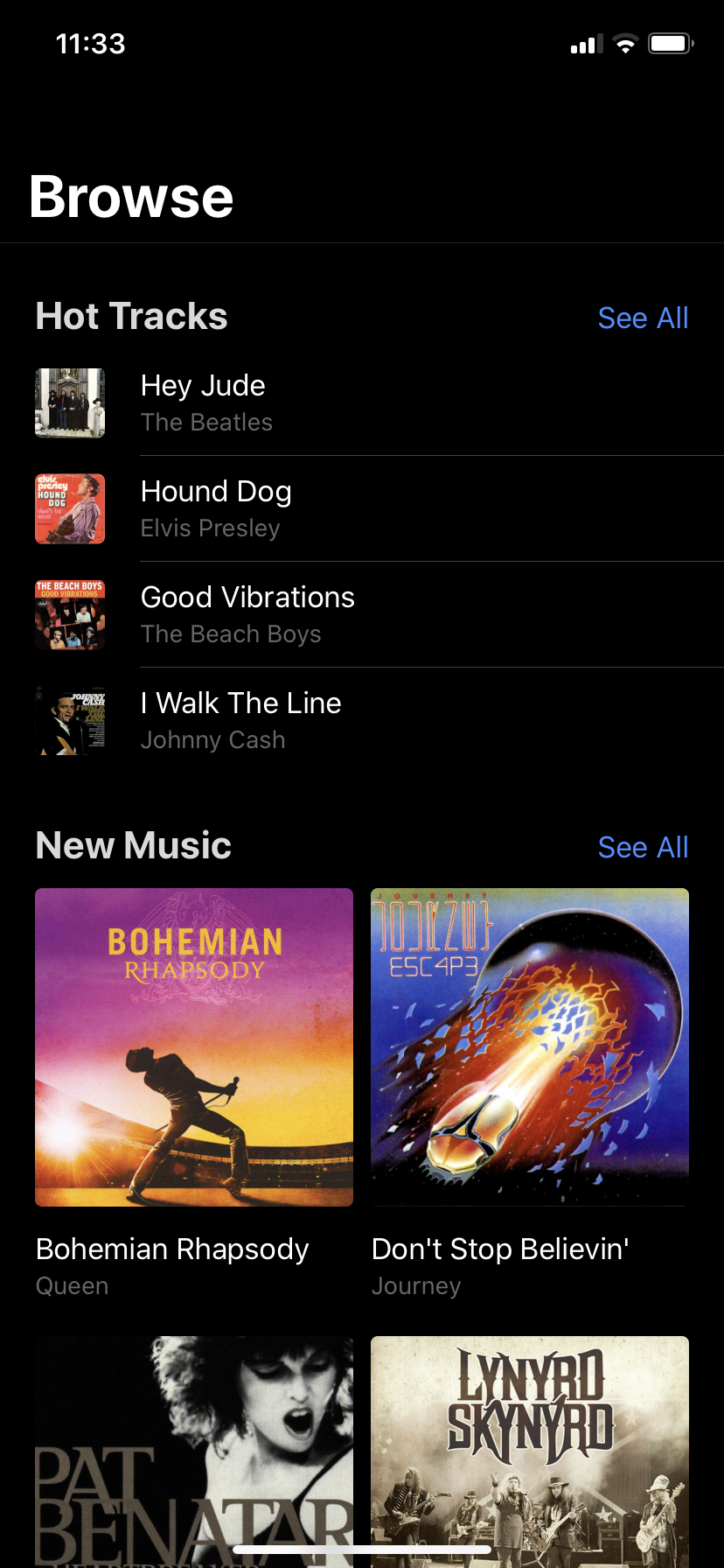
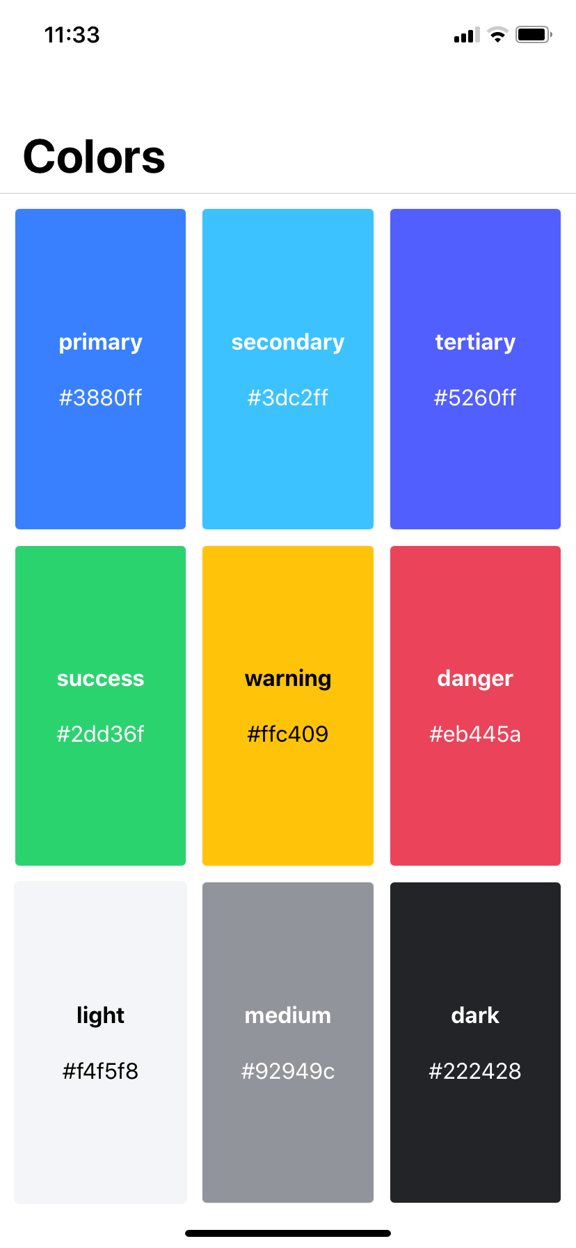
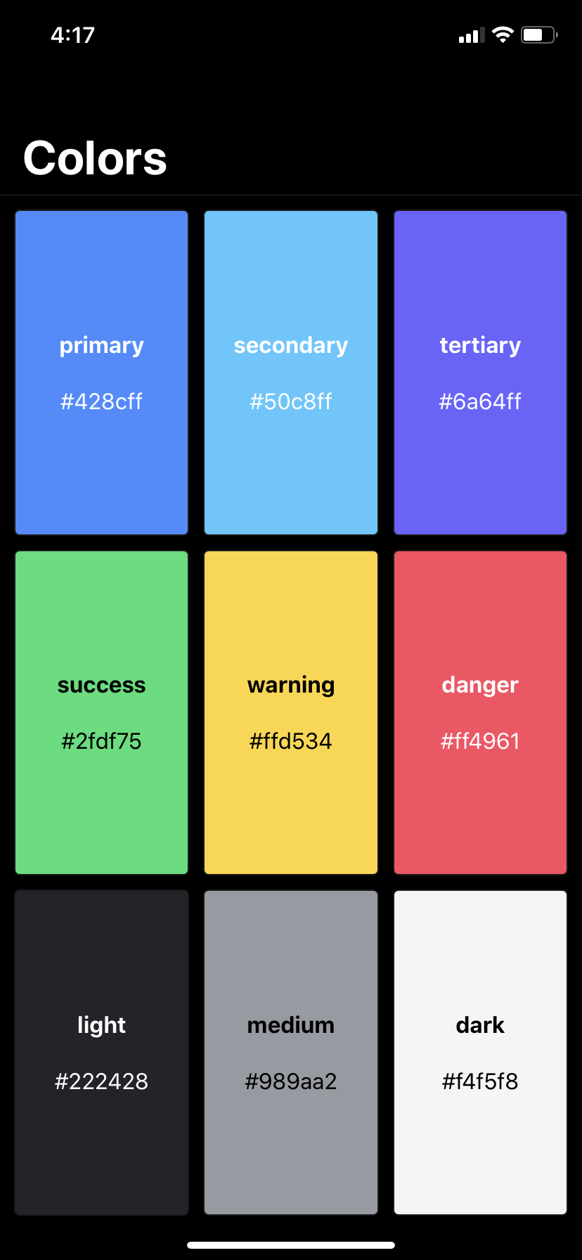
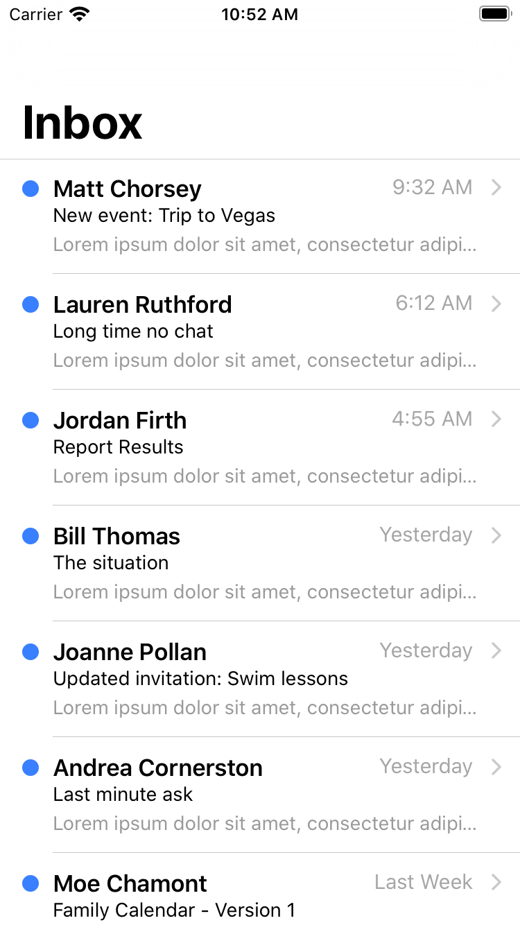
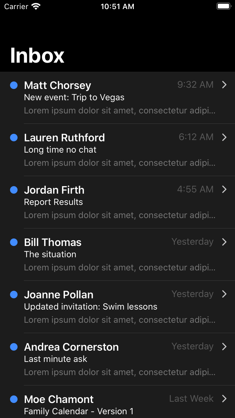
Ionic Colors 🌈
Ionic has been updated with all new colors by default! If your app was not created using one of our starters and you don’t override these colors, you’ll automatically get the new colors in your app. If your app was created using an Angular or React starter, the colors are defined in the theme/variables.scss file and will need to be updated manually.
In addition to the new default colors, we’ve also provided a set of recommended colors to use with dark mode. Head over to the Dark Mode documentation for a guide detailing how to support dark mode based on user preference, including our recommended theme with code to copy & paste!
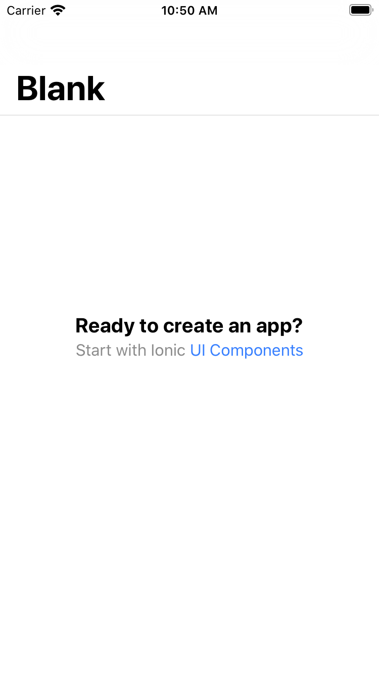
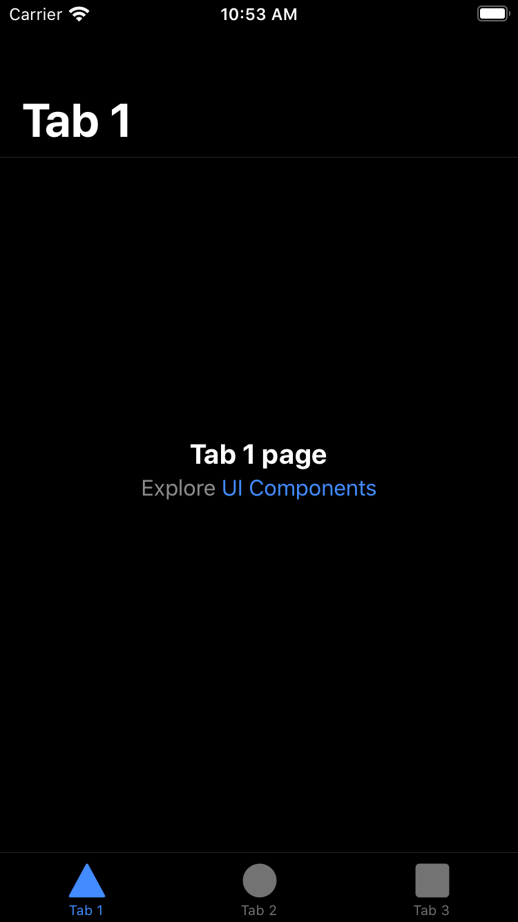
Redesigned Starters 🖌
With all of the changes to the design of our components, we felt it was time to update the design of our existing starters and add a new one! Take a look at the new designs and the new list starter below.
Easier Customization 💅
We’ve heard you loud and clear that components are not easy to customize. One reason for this was a lack of available CSS Variables or way to style inner elements. The other reason was due to components being scoped and their Ionic styles taking priority over custom styles. In order to make it easier to style, we’ve added more CSS variables, converted some scoped components to Shadow DOM, and began adding support for Shadow Parts.
The following components were converted to Shadow DOM:
- Back Button
- Card
- Segment
- Split Pane
Why shadow DOM? One of our biggest reasons for using Shadow DOM is its ability to completely encapsulate styles and prevent them from bleeding into other components. This means we’re able to style specific elements inside of our components without affecting other components that use that element.
In addition to that, Shadow DOM allows us to use CSS custom properties (variables) within the component for easier theming. In previous versions of Ionic Framework, Sass variables were used to customize and theme an app. This requirement not only caused longer build times, but in order to have multiple themes within the same app it required generating multiple CSS files with different Sass variables. CSS variables can be updated at runtime, so an app can change the entire theme based on a CSS class or a prefers-color-scheme media query.
While scoped components allow the use of CSS variables, the selectors that are added to the component make user overrides more difficult, requiring a user to either write an overly complex selector or make use of !important in the CSS styles in order to override the Ionic components. Additionally, if users were to target an inner element of an Ionic component and we were to change the structure or class, this would break the styling of that element.
With the growing support for Shadow Parts in browsers, users will be able to target specific elements inside of our components to override their styles directly.
Learn more about customizing Ionic themes, enabling dark mode, and CSS variables in our docs!
Angular Ivy 🅰️
For Ionic Angular developers, Ionic 5 will bring full support for Ivy, Angular’s new renderer. Ivy enables apps to only require pieces of the renderer that they actually need, instead of the whole thing. This means that our final output will be smaller, which is better for load performance. Read more about Angular Ivy on our blog post.
Breaking Changes 🚨
In the past, a major release of Ionic sometimes caused many breaking changes to the end-user due to internal changes to update the framework it was built on. Our last major release, Ionic 4, was created to avoid this by building Ionic Framework with web components. This has allowed us to only make breaking changes where necessary to improve the framework. A list of all of the breaking changes for this release can be found in our breaking changes document in the ionic repository.
Updating ✅
We recommend updating to the latest Ionic 4 release (4.11.10) to see any deprecation warnings specific to your app in the developer console. After fixing any warnings, it’s as simple as running the following commands:
# for an angular app
npm i @ionic/angular@latest --save

# for a react app
npm i @ionic/react@latest --save
npm i @ionic/react-router@latest --save
npm i ionicons@latest --save

# for a stencil / vanilla JS app
npm i @ionic/core@latest --save
Then, head on over to the breaking changes document to see if there were any other changes that need to be made in your app.
Thank you 🙇♀️
As always, we wanted to extend our sincere thanks to the Ionic community. We would not have been able to pull this off without your support. So many of the issues, pull requests, and comments left by community members have been essential to us getting this release out, and for that we’re extremely grateful. We hope you’re as excited as we are about this release! Tell us your thoughts below. ⬇️