CSSユーティリティ
Ionic Framework は、テキストの順番を入れ替えたり、要素の配置や padding や margin を修正する一連のユーティリティ属性を提供します。これは要素で使うことができます。
利用可能な Ionic Framework スターターを使用してアプリを開始しなかった場合、これらのスタイルを機能させるには、グローバ�ルスタイルシートのオプションセクションにリストされているスタイルシートを含める必要があります。
テキストの修正
Text Align
<ion-grid>
  <ion-row>
    <ion-col>
      <div class="ion-text-start">
        <h3>text-start</h3>
        Lorem ipsum dolor sit amet, consectetur adipiscing elit. Sed ac vehicula lorem.
      </div>
    </ion-col>
    <ion-col>
      <div class="ion-text-end">
        <h3>text-end</h3>
        Lorem ipsum dolor sit amet, consectetur adipiscing elit. Sed ac vehicula lorem.
      </div>
    </ion-col>
    <ion-col>
      <div class="ion-text-center">
        <h3>text-center</h3>
        Lorem ipsum dolor sit amet, consectetur adipiscing elit. Sed ac vehicula lorem.
      </div>
    </ion-col>
  </ion-row>
  <ion-row>
    <ion-col>
      <div class="ion-text-justify">
        <h3>text-justify</h3>
        Lorem ipsum dolor sit amet, consectetur adipiscing elit. Sed ac vehicula lorem.
      </div>
    </ion-col>
    <ion-col>
      <div class="ion-text-wrap">
        <h3>text-wrap</h3>
        Lorem ipsum dolor sit amet, consectetur adipiscing elit. Sed ac vehicula lorem.
      </div>
    </ion-col>
    <ion-col>
      <div class="ion-text-nowrap">
        <h3>text-nowrap</h3>
        Lorem ipsum dolor sit amet, consectetur adipiscing elit.
      </div>
    </ion-col>
  </ion-row>
</ion-grid>
| Class | Style Rule | 説明 |
|---|---|---|
.ion-text-left | text-align: left | インラインコンテンツは行ボックスの左端に揃えられます。 |
.ion-text-right | text-align: right | インラインコンテンツは行ボックスの右端に揃えられます。 |
.ion-text-start | text-align: start | 方向が左から右の場合はtext-leftと同じで、方向が右から左の場合はtext-rightと同じです。 |
.ion-text-end | text-align: end | 方向が左から右の場合はtext-rightと同じで、方向が右から左の場合はtext-leftと同じです。 |
.ion-text-center | text-align: center | インラインコンテンツは行ボックス内で中央揃えされます。 |
.ion-text-justify | text-align: justify | インラインコンテンツは両端揃えされます。テキストは、最後の行を除いて、その左右の端を行ボックスの左右の端に揃えるように間隔を空ける必要があります。 |
.ion-text-wrap | white-space: normal | 空白の連続は折りたたまれます。ソース内の改行文字は他の空白として処理されます。必要に応じて行を折り返して行ボックスを埋めます。 |
.ion-text-nowrap | white-space: nowrap | normalと同様に空白を折りたたみますが、テキスト内の改行(テキストの折り返し)を抑制します。 |
Text Transform
<ion-grid>
  <ion-row>
    <ion-col>
      <div class="ion-text-uppercase">
        <h3>text-uppercase</h3>
        Lorem ipsum dolor sit amet, consectetur adipiscing elit. Sed ac vehicula lorem.
      </div>
    </ion-col>
    <ion-col>
      <div class="ion-text-lowercase">
        <h3>text-lowercase</h3>
        Lorem ipsum dolor sit amet, consectetur adipiscing elit. Sed ac vehicula lorem.
      </div>
    </ion-col>
    <ion-col>
      <div class="ion-text-capitalize">
        <h3>text-capitalize</h3>
        Lorem ipsum dolor sit amet, consectetur adipiscing elit. Sed ac vehicula lorem.
      </div>
    </ion-col>
  </ion-row>
</ion-grid>
| Class | Style Rule | 説明 |
|---|---|---|
.ion-text-uppercase | text-transform: uppercase | すべての文字を大文字に変換します。 |
.ion-text-lowercase | text-transform: lowercase | すべての文字を小文字に変換します。 |
.ion-text-capitalize | text-transform: capitalize | 各単語の最初の文字を大文字に変換します。 |
Responsive Text Classes
上に挙げたすべてのテキストクラスには、スクリーンサイズに応じてテキストを変更するための追加のクラスがあります。各クラスで text- の代わりに text-{breakpoint}- を使用すると、特定のスクリーンサ��イズでのみそのクラスを使用できます。ここで {breakpoint} は Ionic Breakpoints にリストされているブレークポイント名のうちの 1 つです。
以下の表は、 {modifier} のデフォルトの挙動です。 left, right, start, end, center, justify, wrap, nowrap, uppercase, lowercase, capitalize は上記の通りです。
| Class | 説明 |
|---|---|
.ion-text-{modifier} | すべての画面サイズで要素に修飾子を適用します。 |
.ion-text-sm-{modifier} | min-width: 576pxのときに要素に修飾子を適用します。 |
.ion-text-md-{modifier} | min-width: 768pxのときに要素に修飾子を適用します。 |
.ion-text-lg-{modifier} | min-width: 992pxのときに要素に修飾子を適用します。 |
.ion-text-xl-{modifier} | min-width: 1200pxのときに要素に修飾子を適用します。 |
要素の配置
Float
float CSS プロパティは、要素をコンテナの左側または右側に配置する必要��があることを指定します。テキストとインライン要素はその周りに折り返されます。この方法により、要素は Web ページの通常のフローから取り出されますが、絶対配置とは異なり、フローの一部として残ります。
<ion-grid>
  <ion-row>
    <ion-col>
      <h3>no float</h3>
      <img
        alt="Silhouette of a person's head"
        src="https://ionicframework.com/docs/img/demos/avatar.svg"
        height="50px"
      />
      Lorem ipsum dolor sit amet, consectetur adipiscing elit. Sed ac vehicula lorem.
    </ion-col>
    <ion-col>
      <h3>float-left</h3>
      <img
        alt="Silhouette of a person's head"
        src="https://ionicframework.com/docs/img/demos/avatar.svg"
        height="50px"
        class="ion-float-left"
      />
      Lorem ipsum dolor sit amet, consectetur adipiscing elit. Sed ac vehicula lorem.
    </ion-col>
    <ion-col>
      <h3>float-right</h3>
      <img
        alt="Silhouette of a person's head"
        src="https://ionicframework.com/docs/img/demos/avatar.svg"
        height="50px"
        class="ion-float-right"
      />
      Lorem ipsum dolor sit amet, consectetur adipiscing elit. Sed ac vehicula lorem.
    </ion-col>
  </ion-row>
</ion-grid>
| Class | Style Rule | 説明 |
|---|---|---|
.ion-float-left | float: left | 要素は包含ブロックの左側にフロートします。 |
.ion-float-right | float: right | 要素は包含ブロックの右側にフロートします。 |
.ion-float-start | float: left / float: right | 方向が左から右の場合はfloat-leftと同じで、方向が右から左の場合はfloat-rightと同じです。 |
.ion-float-end | float: left / float: right | 方向が左から右の場合はfloat-rightと同じで、方向が右から左の場合はfloat-leftと同じです。 |
レスポンシブな Float クラス
上記のすべての float クラスには、画面サイズに基づいて float を変更するための追加クラスがあります。特定の画面サイズでのみクラスを使用する場合は、各クラスで float- の代わりにfloat-{breakpoint}- を使用します。 {breakpoint} は、Ionic Breakpointsにリストされているブレークポイント名の 1 つです。
次の表に、デフォルトの動作を示します。 {modifier} は、前述のように left, right, start, end のいずれかです。
| Class | 説明 |
|---|---|
.ion-float-{modifier} | すべての画面サイズで要素に修飾子を適用します。 |
.ion-float-sm-{modifier} | min-width: 576pxのときに要素に修飾子を適用します。 |
.ion-float-md-{modifier} | min-width: 768pxのときに要素に修飾子を適用します。 |
.ion-float-lg-{modifier} | min-width: 992pxのときに要素に修飾子を適用します。 |
.ion-float-xl-{modifier} | min-width: 1200pxのときに要素に修飾子を適用します。 |
要素の表示
Display
display CSS プロパティは、要素をブロックまたはインラインボックスとして扱うかどうか、およびその子に使用されるレイアウト(フローレイアウト、グリッド、flex など)を設定します。レイアウトから要素を完全に非表示にするためにも使用できます。
Ionic はdisplay用に以下のユーティリティクラスを提供します:
| Class | Style Rule | 説明 |
|---|---|---|
.ion-display-none | display: none | 要素の表示をオフにして、レイアウトに影響を与えないようにします(要素が存在しないかのようにドキュメントがレンダリングされます)。 |
.ion-display-inline | display: inline | 要素はインライン要素として動作し、その前後に改行を作成しません。 |
.ion-display-inline-block | display: inline-block | 要素はブロック要素として動作し、単一のインラインボックスであるかのように周囲のコンテンツと流れます。 |
.ion-display-block | display: block | 要素はブロック要素として動作し、通常のフローではその前後に改行を作成します。 |
.ion-display-flex | display: flex | 要素はブロック要素のように動作し、flexbox モデルに従ってコンテンツをレイアウトします。 |
.ion-display-inline-flex | display: inline-flex | 要素はインライン要素のように動作し、flexbox モデルに従ってコンテンツをレイアウトします。 |
.ion-display-grid | display: grid | 要素はブロック要素のように動作し、グリッドモデルに従ってコンテンツをレイアウトします。 |
.ion-display-inline-grid | display: inline-grid | 要素はインライン要素のように動作し、グリッドモデルに従ってコンテンツをレイアウトします。 |
.ion-display-table | display: table | 要素は HTML の<table>要素のように動作します。ブロックレベルのボックスを定義します。 |
.ion-display-table-cell | display: table-cell | 要素は HTML の<td>要素のように動作します。 |
.ion-display-table-row | display: table-row | 要素は HTML の<tr>要素のように動作します。 |
レスポンシブ Display クラス
上記のすべての display クラスには、画面サイズに基づいて display を変更する追加のクラスがあります。各クラスでdisplay-の代わりにdisplay-{breakpoint}-を使用して、特定の画面サイズでのみクラスを使用します。{breakpoint}はIonic Breakpointsにリストされているブレークポイント名の 1 つです。
以下の表は、デフォルトの動作を示しています。{modifier}は、上記で説明されているように、none、inline、inline-block、block、flex、inline-flex、grid、inline-grid、table、table-cell、table-rowのいずれかです。
| Class | 説明 |
|---|---|
.ion-display-{modifier} | すべての画面サイズで要素に修飾子を適用します。 |
.ion-display-sm-{modifier} | min-width: 576pxのときに要素に修飾子を適用します。 |
.ion-display-md-{modifier} | min-width: 768pxのときに要素に修飾子を適用します。 |
.ion-display-lg-{modifier} | min-width: 992pxのときに要素に修飾子を適用します。 |
.ion-display-xl-{modifier} | min-width: 1200pxのときに要素に修飾子を適用します。 |
非推奨クラス
以下のクラスは非推奨であり、次のメジャーリリースで削除されます。代わりに推奨される.ion-display-*クラスを使用してください。
| Class | 説明 |
|---|---|
.ion-hide | すべての画面サイズで要素にdisplay: noneを適用します。 非推奨 — 代わりに ion-display-noneク��ラスを使用してください。 |
.ion-hide-sm-{dir} | min-width: 576px(up)またはmax-width: 576px(down)のときに要素に修飾子を適用します。 非推奨 — 代わりに ion-display-sm-{modifier}クラスを使用してください。 |
.ion-hide-md-{dir} | min-width: 768px(up)またはmax-width: 768px(down)のときに要素に修飾子を適用します。 非推奨 — 代わりに ion-display-md-{modifier}クラスを使用してください。 |
.ion-hide-lg-{dir} | min-width: 992px(up)またはmax-width: 992px(down)のときに要素に修飾子を適用します。 非推奨 — 代わりに ion-display-lg-{modifier}クラスを使用してください。 |
.ion-hide-xl-{dir} | min-width: 1200px(up)またはmax-width: 1200px(down)のときに要素に修飾子を適用します。 非推奨 — 代わりに ion-display-xl-{modifier}クラスを使用してください。 |
コンテンツのスペース
Padding
padding 属性は、要素の padding エリアを設定しま�す。padding エリアは、要素のコンテンツとその境界線のスペースです。
padding で適用されるデフォルトの数値は 16px で、これは --ion-padding 変数で設定することができます。これらの値を変更する方法については CSS Variables をご覧ください。
<ion-grid>
  <ion-row>
    <ion-col class="ion-padding">
      <div>padding</div>
    </ion-col>
    <ion-col class="ion-padding-top">
      <div>padding-top</div>
    </ion-col>
    <ion-col class="ion-padding-start">
      <div>padding-start</div>
    </ion-col>
    <ion-col class="ion-padding-end">
      <div>padding-end</div>
    </ion-col>
  </ion-row>
  <ion-row>
    <ion-col class="ion-padding-bottom">
      <div>padding-bottom</div>
    </ion-col>
    <ion-col class="ion-padding-vertical">
      <div>padding-vertical</div>
    </ion-col>
    <ion-col class="ion-padding-horizontal">
      <div>padding-horizontal</div>
    </ion-col>
    <ion-col class="ion-no-padding">
      <div>no-padding</div>
    </ion-col>
  </ion-row>
</ion-grid>
| Class | Style Rule | 説明 |
|---|---|---|
.ion-padding | padding: 16px | すべての側にパディングを適用します。 |
.ion-padding-top | padding-top: 16px | 上部にパディングを適用します。 |
.ion-padding-start | padding-start: 16px | 開始側にパディングを適用します。 |
.ion-padding-end | padding-end: 16px | 終了側にパディングを適用します。 |
.ion-padding-bottom | padding-bottom: 16px | 下部にパディングを適用します。 |
.ion-padding-vertical | padding: 16px 0 | 上下にパディングを適用します。 |
.ion-padding-horizontal | padding: 0 16px | 左右にパディングを適用します。 |
.ion-no-padding | padding: 0 | すべての側にパディングを適用しません。 |
Margin
Margin エリアは、隣り合う要素とのスペースを広げるために境界線の外に空のエリアをつくるためのものです。
margin はデフォルトで 16px が設定されており、 --ion-margin 変数で設定されています。 これらの値を変更する方法については CSS Variables をご覧ください。
<ion-grid>
  <ion-row>
    <ion-col class="ion-margin">
      <div>margin</div>
    </ion-col>
    <ion-col class="ion-margin-top">
      <div>margin-top</div>
    </ion-col>
    <ion-col class="ion-margin-start">
      <div>margin-start</div>
    </ion-col>
    <ion-col class="ion-margin-end">
      <div>margin-end</div>
    </ion-col>
  </ion-row>
  <ion-row>
    <ion-col class="ion-margin-bottom">
      <div>margin-bottom</div>
    </ion-col>
    <ion-col class="ion-margin-vertical">
      <div>margin-vertical</div>
    </ion-col>
    <ion-col class="ion-margin-horizontal">
      <div>margin-horizontal</div>
    </ion-col>
    <ion-col class="ion-no-margin">
      <div>no-margin</div>
    </ion-col>
  </ion-row>
</ion-grid>
| Class | Style Rule | 説明 |
|---|---|---|
.ion-margin | margin: 16px | すべての側にマージンを適用します。 |
.ion-margin-top | margin-top: 16px | 上部にマージンを適用します。 |
.ion-margin-start | margin-start: 16px | 開始側にマージンを適用します。 |
.ion-margin-end | margin-end: 16px | 終了側にマージンを適用します。 |
.ion-margin-bottom | margin-bottom: 16px | 下部にマージンを適用します。 |
.ion-margin-vertical | margin: 16px 0 | 上下にマージンを適用します。 |
.ion-margin-horizontal | margin: 0 16px | 左右にマージンを適用します。 |
.ion-no-margin | margin: 0 | すべての側にマージンを適用しません。 |
Flex コンテナプロパティ
Flexbox プロパティは、すべての flex アイテムのレイアウトを制御するコンテナプロパティと、個々の flex アイテムを制御するアイテムプロパティの 2 つのカテゴリに分けられます。アイテムレベルの配置については、Flex Item Propertiesを参照してください。

Align Items
align-items CSS プロパティは、すべての直接の子要素をグループとしてalign-self値を設定します。flexbox では、交差軸上のアイテムの配置を制御します。グリッドレイアウトでは、グリッド領域内のブロック軸上のアイテムの配置を制御します。
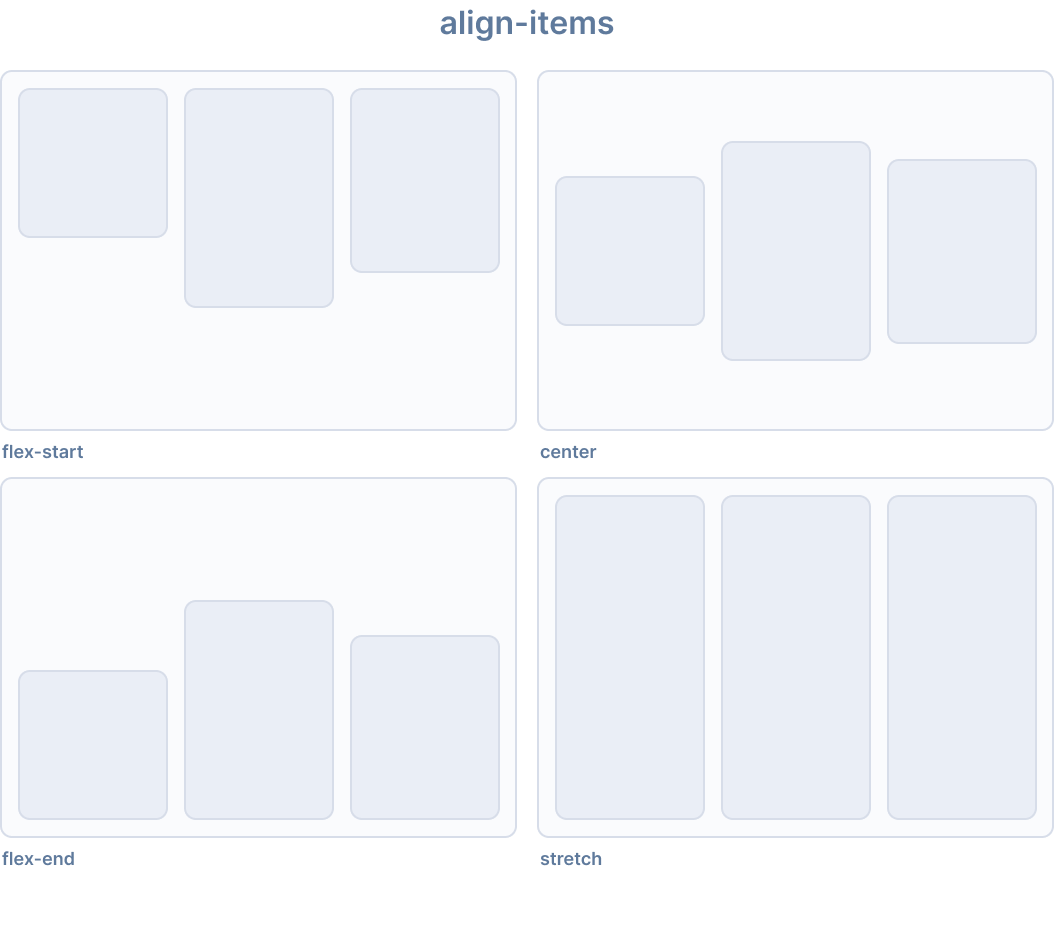
Ionic はalign-items用に以下のユーティリティクラスを提供します:
| Class | Style Rule | 説明 |
|---|---|---|
.ion-align-items-start | align-items: flex-start | アイテムは交差軸の開始側に詰められます。 |
.ion-align-items-end | align-items: flex-end | アイテムは交差軸の終了側に詰められます。 |
.ion-align-items-center | align-items: center | アイテムは交差軸に沿って中央揃えされます。 |
.ion-align-items-baseline | align-items: baseline | アイテムはベースラインが揃うように配置されます。 |
.ion-align-items-stretch | align-items: stretch | アイテムはコンテナを埋めるように伸ばされます。 |
Align Content
align-content CSS プロパティは、flexbox の交差軸、またはグリッドまたはブロックレベル要素のブロック軸に沿って、コンテンツアイテム間および周囲のスペースの分布を設定します。
このプロパティは、単一行の flex コンテナ(つまり、flex-wrap: nowrapを持つもの)には影響しません。
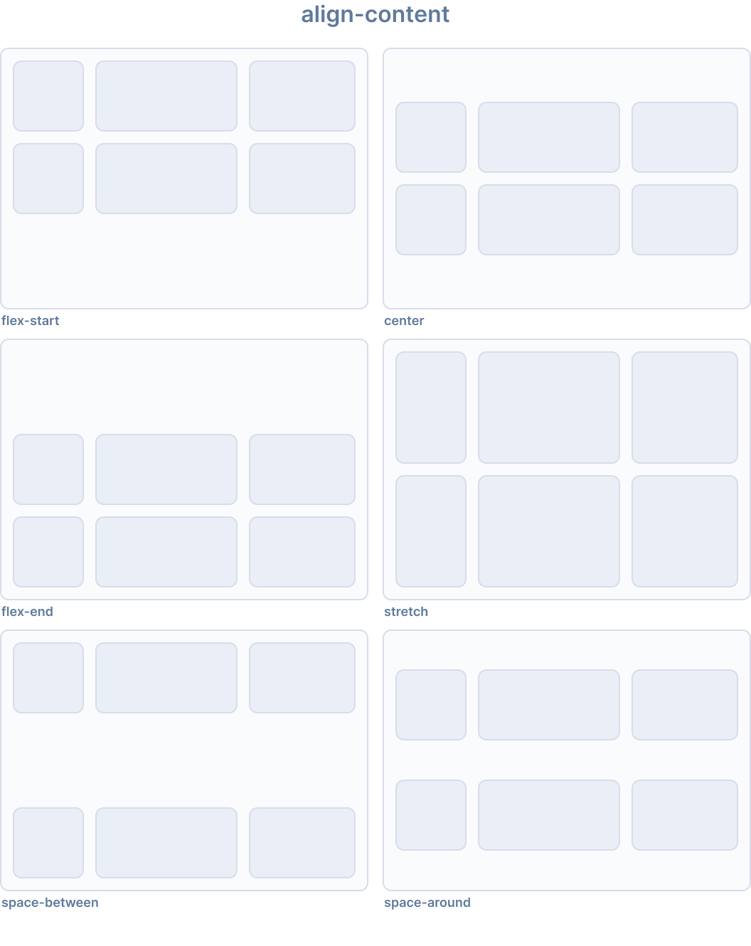
Ionic はalign-content用に以下のユーティリティクラスを提供します:
| Class | Style Rule | 説明 |
|---|---|---|
.ion-align-content-start | align-content: flex-start | 行は交差軸の開始側に詰められます。 |
.ion-align-content-end | align-content: flex-end | 行は交差軸の終了側に詰められます。 |
.ion-align-content-center | align-content: center | 行は交差軸に沿って中央揃えされます。 |
.ion-align-content-stretch | align-content: stretch | 行はコンテナを埋めるように伸ばされます。 |
.ion-align-content-between | align-content: space-between | 行は交差軸上で均等に配置されます。 |
.ion-align-content-around | align-content: space-around | 行は周囲に等しいスペースを持って均等に配置されます。 |
Justify Content
justify-content CSS プロパティは、ブラウザが flex コンテナの主軸、およびグリッドとマルチカラムコンテナのインライン軸に沿って、コンテンツアイテム間および周囲のスペースをどのように分配するかを定義します。
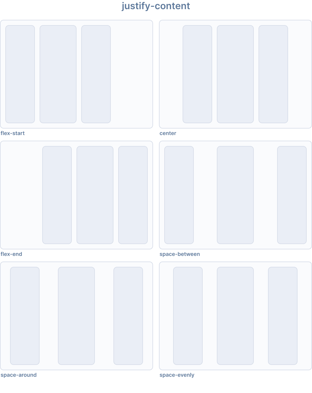
Ionic はjustify-content用に以下のユーティリティクラスを提供します:
| Class | Style Rule | 説明 |
|---|---|---|
.ion-justify-content-start | justify-content: flex-start | アイテムは主軸の開始側に詰められます。 |
.ion-justify-content-end | justify-content: flex-end | アイテムは主軸の終了側に詰められます。 |
.ion-justify-content-center | justify-content: center | アイテムは主軸に沿って中央揃えされます。 |
.ion-justify-content-around | justify-content: space-around | アイテムは主軸上で周囲に等しいスペースを持って均等に配置されます。 |
.ion-justify-content-between | justify-content: space-between | アイテムは主軸上で均等に配置されます。 |
.ion-justify-content-evenly | justify-content: space-evenly | アイテムは、任意の 2 つのアイテム間のスペースが等しくなるように配置されます。 |
Flex Direction
flex-direction CSS プロパティは、flex アイテムが flex コンテナ内にどのように配置されるかを設定し、主軸と方向(通常または逆)を定義します。
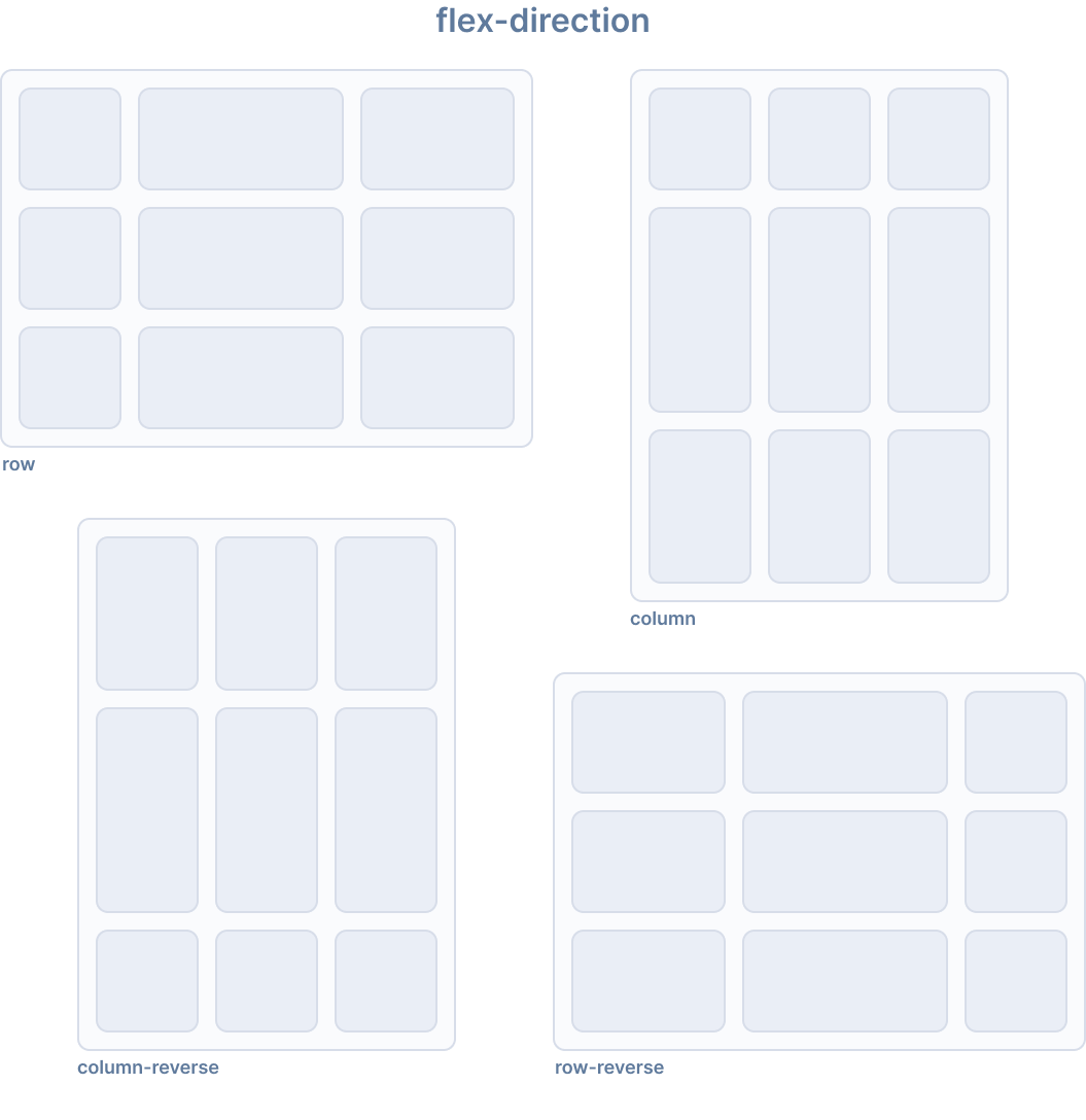
Ionic はflex-direction用に以下のユーティリティクラスを提供します:
| Class | Style Rule | 説明 |
|---|---|---|
.ion-flex-row | flex-direction: row | アイテムはテキストの方向と同じ方向に配置されます。 |
.ion-flex-row-reverse | flex-direction: row-reverse | アイテムはテキストの方向と逆の方向に配置されます。 |
.ion-flex-column | flex-direction: column | アイテムは垂直に配置されます。 |
.ion-flex-column-reverse | flex-direction: column-reverse | アイテムは逆順で垂直に配置されます。 |
Flex Wrap
flex-wrap CSS プロパティは、flex アイテムが 1 行に強制されるか、複数行に折り返すことができるかを設定します。折り返しが許可されている場合、行が積み重ねられる方向を設定します。
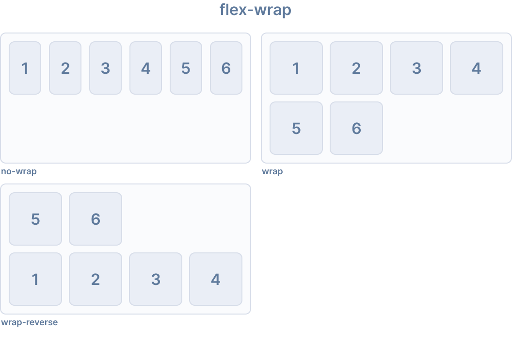
Ionic はflex-wrap用に以下のユーティリティクラスを提供します:
| Class | Style Rule | 説明 |
|---|---|---|
.ion-flex-nowrap | flex-wrap: nowrap | すべてのアイテムが 1 行になります。 |
.ion-flex-wrap | flex-wrap: wrap | アイテムは複数行に折り返され、上から下へ配置されます。 |
.ion-flex-wrap-reverse | flex-wrap: wrap-reverse | アイテムは複数行に折り返され、下から上へ配置されます。 |
レスポンシブ Flex コンテナクラス
上記のすべての flex コンテナクラスには、画面サイズに基づいてプロパティを変更する追加のクラスがあります。基本クラス名の代わりに、{property}-{breakpoint}-{modifier}を使用して、特定の画面サイズでのみクラスを使用します。{breakpoint}はIonic Breakpointsにリストされているブレークポイント名の 1 つです。
以下の表は、デフォルトの動作を示しています。{property}は次のいずれかです:justify-content、align-content、align-items、flex、またはflex-wrap。{modifier}は上記で説明されている対応する値です。
| Class | Description |
|---|---|
.ion-{property}-{modifier} | Applies the modifier to the element on all screen sizes. |
.ion-{property}-sm-{modifier} | Applies the modifier to the element when min-width: 576px. |
.ion-{property}-md-{modifier} | Applies the modifier to the element when min-width: 768px. |
.ion-{property}-lg-{modifier} | Applies the modifier to the element when min-width: 992px. |
.ion-{property}-xl-{modifier} | Applies the modifier to the element when min-width: 1200px. |
非推奨クラス
以下のクラスは非推奨であり、次のメジャーリリースで削除されます。代わりに推奨される.ion-flex-*クラスを使用してください。
| Class | 説明 |
|---|---|
.ion-nowrap | すべてのアイテ��ムが 1 行になります。 非推奨 — 代わりに .ion-flex-nowrapを使用してください。 |
.ion-wrap | アイテムは複数行に折り返され、上から下へ配置されます。 非推奨 — 代わりに .ion-flex-wrapを使用してください。 |
.ion-wrap-reverse | アイテムは複数行に折り返され、下から上へ配置されます。 非推奨 — 代わりに .ion-flex-wrap-reverseを使用してください。 |
Flex アイテムプロパティ
Flex アイテムプロパティは、個々の flex アイテムが flex コンテナ内でどのように動作するかを制御します。コンテナレベルの配置については、Flex Container Propertiesも参照してください。
Align Self
align-self CSS プロパティは、グリッドまたは flex アイテムの align-items 値をオーバーライドします。グリッドでは、グリッド領域内でアイテムを配置します。flexbox では、交差軸上でアイテムを配置します。
このプロパティは、ブロックレベルのボックスやテーブルセルには適用されません。flexbox アイテムの交差軸マージンがautoの場合、align-selfは無視されます。
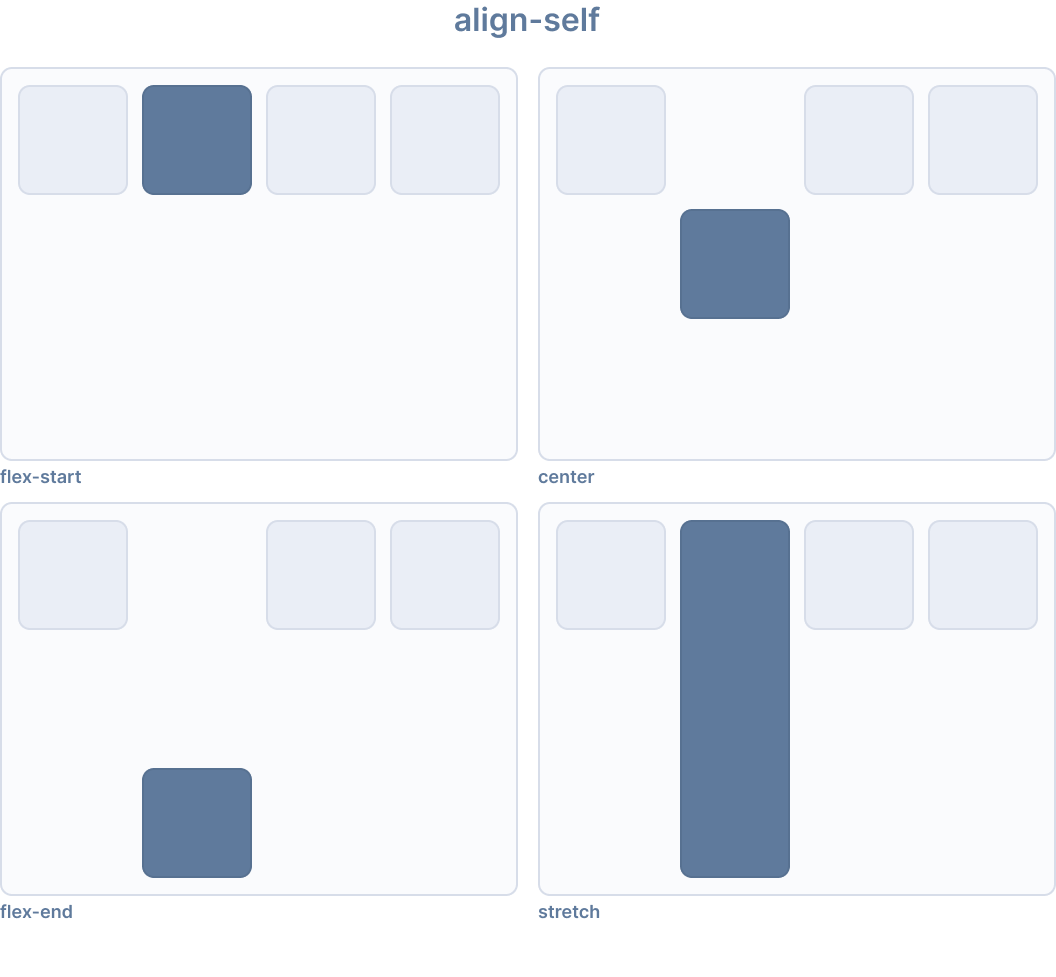
Ionic はalign-self用に以下のユーティリティクラスを提供します:
| Class | Style Rule | 説明 |
|---|---|---|
.ion-align-self-start | align-self: flex-start | アイテムは交差軸の開始側に詰められます。 |
.ion-align-self-end | align-self: flex-end | アイテムは交差軸の終了側に詰められます。 |
.ion-align-self-center | align-self: center | アイテムは交差軸に沿って中央揃えされます。 |
.ion-align-self-baseline | align-self: baseline | アイテムは、そのベースラインが他のアイテムのベースラインと揃うように配置されます。 |
.ion-align-self-stretch | align-self: stretch | アイテムはコンテナを埋めるように伸ばされます。 |
.ion-align-self-auto | align-self: auto | アイテムは親のalign-items値に従って配置されます。 |
Flex
flex CSS プロパティは、flex-grow、flex-shrink、flex-basisの短縮プロパティです。flex アイテムが flex コンテナ内で利用可能なスペースに合わせてどのように拡大または�縮小するかを設定します。
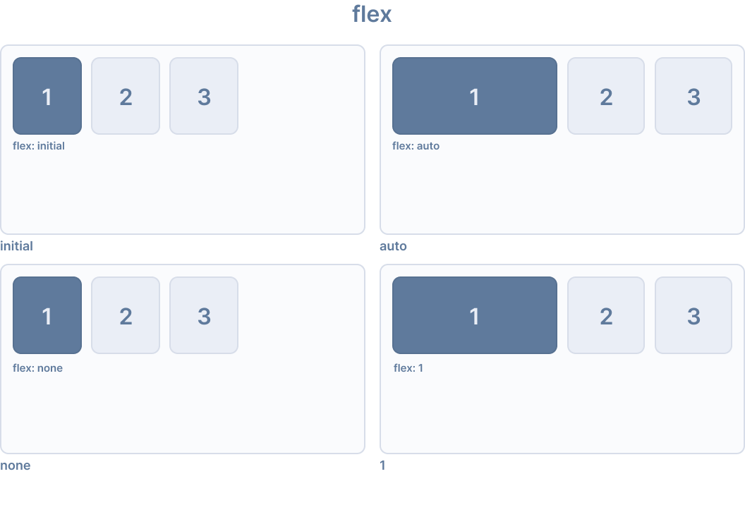
Ionic はflex用に以下のユーティリティクラスを提供します:
| Class | Style Rule | 説明 |
|---|---|---|
.ion-flex-1 | flex: 1 | アイテムは他の flex アイテムと等しく拡大および縮小します。 |
.ion-flex-auto | flex: auto | アイテムはそのコンテンツサイズに基づいて拡大および縮小します。 |
.ion-flex-initial | flex: initial | アイテムは最小コンテンツサイズまで縮小しますが、拡大しません。 |
.ion-flex-none | flex: none | アイテムは拡大も縮小もしません。 |
Flex Grow
flex-grow CSS プロパティは、flex 拡大係数を設定します。これは、flex コンテナの正の自由スペース(存在する場合)のうち、flex アイテムの主サイズに割り当てるべき量を指定します。
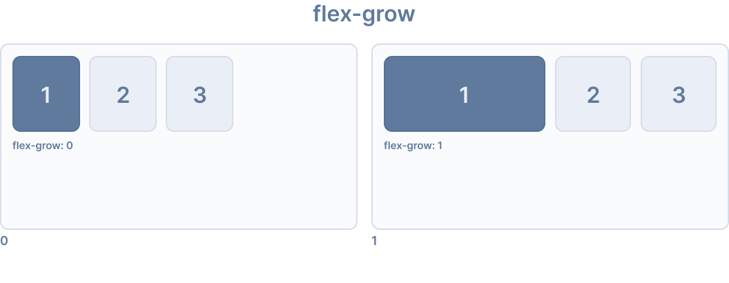
Ionic はflex-grow用に以下のユーティリティクラスを提供します:
| Class | Style Rule | 説明 |
|---|---|---|
.ion-flex-grow-0 | flex-grow: 0 | アイテムはコンテンツサイズを超えて拡大しませ��ん。 |
.ion-flex-grow-1 | flex-grow: 1 | アイテムは利用可能なスペースを比例して埋めるように拡大します。 |
Flex Shrink
flex-shrink CSS プロパティは、flex アイテムの flex 縮小係数を設定します。すべての flex アイテムのサイズが flex コンテナより大きい場合、flex アイテムはflex-shrink値に従って縮小して収まります。各 flex 行の負の自由スペースは、flex-shrink値が0より大きい行の flex アイテム間で分配されます。
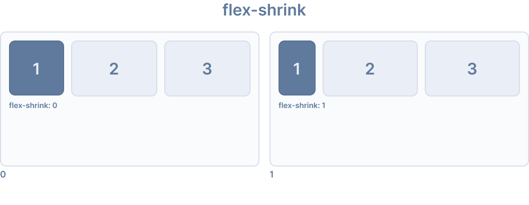
Ionic はflex-shrink用に以下のユーティリティクラスを提供します:
| Class | Style Rule | 説明 |
|---|---|---|
.ion-flex-shrink-0 | flex-shrink: 0 | アイテムはコンテンツサイズを下回って縮小しません。 |
.ion-flex-shrink-1 | flex-shrink: 1 | コンテナが小さすぎる場合、アイテムは比例して縮小します。 |
Order
order CSS プロパティは、flex またはグリッドコンテ�ナ内でアイテムをレイアウトする順序を設定します。コンテナ内のアイテムは、昇順のorder値で並べ替えられ、次にソースコードの順序で並べ替えられます。明示的なorder値が指定されていないアイテムには、デフォルト値0が割り当てられます。
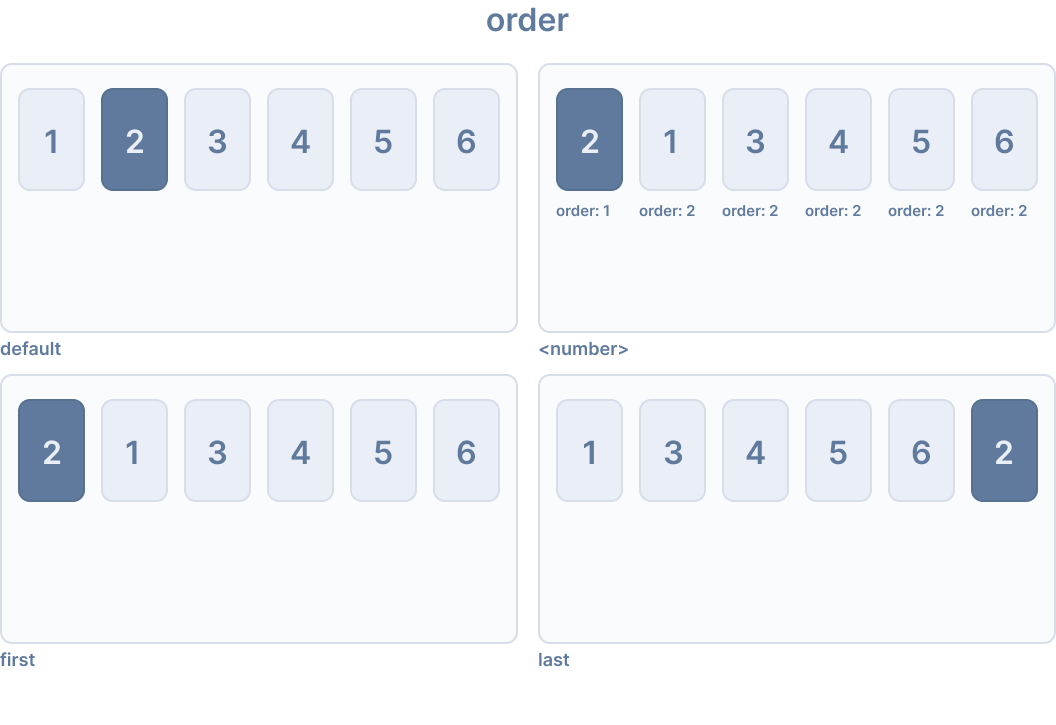
Ionic はorder用に以下のユーティリティクラスを提供します:
| Class | Style Rule | 説明 |
|---|---|---|
.ion-order-first | order: -1 | アイテムは flex コンテナの最初に表示されます。 |
.ion-order-0 | order: 0 | アイテムは自然な順序で表示されます。 |
.ion-order-1 | order: 1 | アイテムは order 0 のアイテムの後に表示されます。 |
.ion-order-2 | order: 2 | アイテムは order 1 のアイテムの後に表示されます。 |
.ion-order-3 | order: 3 | アイテムは order 2 のアイテムの後に表示されます。 |
.ion-order-4 | order: 4 | アイテムは order 3 のアイテムの後に表示されます。 |
.ion-order-5 | order: 5 | アイテムは order 4 のアイテムの後に表示されます。 |
.ion-order-6 | order: 6 | アイテムは order 5 のアイテムの後に表示されます。 |
.ion-order-7 | order: 7 | アイテムは order 6 のアイテムの後に表示されます。 |
.ion-order-8 | order: 8 | アイテムは order 7 のアイテムの後に表示されます。 |
.ion-order-9 | order: 9 | アイテムは order 8 のアイテムの後に表示されます。 |
.ion-order-10 | order: 10 | アイテムは order 9 のアイテムの後に表示されます。 |
.ion-order-11 | order: 11 | アイテムは order 10 のアイテムの後に表示されます。 |
.ion-order-12 | order: 12 | アイテムは order 11 のアイテムの後に表示されます。 |
.ion-order-last | order: 13 | アイテムは flex コンテナの最後に表示されます。 |
レスポンシブ Flex アイテムクラス
上記のすべての flex アイテムクラスには、画面サイズに基づいてプロパティを変更する追加のクラスがあります。基本クラス名の代わりに、{property}-{breakpoint}-{modifier}を使用して、特定の画面サイズでのみクラスを使用します。{breakpoint}はIonic Breakpointsにリストされているブレークポイント名の 1 つです。
以下の表は、デフォルトの動作を示しています。{property}は次のいずれかです:align-self、flex、flex-grow、flex-shrink、またはorder。{modifier}は�上記で説明されている対応する値です。
| Class | 説明 |
|---|---|
.ion-{property}-{modifier} | すべての画面サイズで要素に修飾子を適用します。 |
.ion-{property}-sm-{modifier} | min-width: 576pxのときに要素に修飾子を適用します。 |
.ion-{property}-md-{modifier} | min-width: 768pxのときに要素に修飾子を適用します。 |
.ion-{property}-lg-{modifier} | min-width: 992pxのときに要素に修飾子を適用します。 |
.ion-{property}-xl-{modifier} | min-width: 1200pxのときに要素に修飾子を適用します。 |
ボーダー表示
.ion-no-borderユーティリティクラスは、Ionic コンポーネントからボーダーを削除するために使用できます。このクラスはion-headerとion-footerコンポーネントに適用できます。
<ion-header class="ion-no-border">
  <ion-toolbar>
    <ion-title>Header - No Border</ion-title>
  </ion-toolbar>
</ion-header>

<ion-footer class="ion-no-border">
  <ion-toolbar>
    <ion-title>Footer - No Border</ion-title>
  </ion-toolbar>
</ion-footer>
| Class | 説明 |
|---|---|
.ion-no-border | 要素にボーダーがありません。 |
Ionic のブレイクポイント
Ionic は、画面サイズに基づいてアプリケーションのスタイルを変えるために、メディアクエリでブレークポイントを使用します。次のブレークポイント名は、上記のユーティリティークラスで使用され、幅が一致したときにクラスが適用されます。
| Breakpoint Name | Width |
|---|---|
xs | 0 |
sm | 576px |
md | 768px |
lg | 992px |
xl | 1200px |