高度なカスタマイズ
CSS ベースのテーマ設定では、CSS ファイルをロードするか、いくつかの CSS プロパティ値を変更することで、アプリの配色をすばやくカスタマイズできます。
theme-color Meta
メタタグの theme-color は、ブラウザがページや周囲のインターフェイスの表示をカスタマイズするために使用する色を示します。この種類の meta タグはメディアクエリも受け付けることができ、開発者はライトモードとダークモードの両方でテーマカラーを設定することができます。
メタタグ theme-color の content 値には、有効な CSS Color を含める必要があり、CSS Variables を含めることはできません。
Theme-colorメタは、Web ブラウザまたは PWA として実行するときにインターフェースのテーマを制御し、アプリが Capacitor または Cordova を使用してデプロイされるときには影響しません。ステータスバーの下の領域をカスタマイズしたい場合は、Capacitor Status Bar Pluginを使用することをお勧めします。
以下の例では、iOS 15 でブラウザのインターフェイスをスタイルするために theme-color を使用する方法を示しています。
<meta name="theme-color" media="(prefers-color-scheme: light)" content="#0054e9" />
<meta name="theme-color" media="(prefers-color-scheme: dark)" content="#eb445a" />
| Light Mode | Dark Mode |
|---|---|
 |  |
macOS Monterey 以降の Safari では、theme-colorメタを使用してツールバーをカスタマイズすることもできます。
iOS 15 と macOS の Safari は自動的に適切なテーマカラーを決定しますが、テーマをより細かく制御したい場合はこの meta タグを追加すると便利です。
ブラウザのインターフェイスに干渉するため、ブラウザが使用しない色の小さな��サブセットがあります。例えば、content="red"と設定すると、macOS の Safari では、ツールバーの赤い閉じるボタンと干渉してしまうため、動作しません。このような状況に遭遇した場合は、色の選択を少し変えてみてください。
ブラウザは manifest.json に theme よりも theme-color メタが存在する場合、それを優先します。
詳しくは、MDN theme-color documentation をご覧ください。
グローバル変数
テーマセクションのアプリケーション変数とステップ変数は、アプリケーションの色を変更するのに便利ですが、しばしば、複数のコンポーネントで使用される変数が必要になることがあり�ます。以下の変数は、コンポーネント間で共有され、グローバルなパディング設定などを変更することができます。
アプリケーション変数
| Name | 説明 |
|---|---|
--ion-font-family | アプリのフォントファミリー |
--ion-statusbar-padding | アプリのステータスバーの上部パディング |
--ion-safe-area-top | アプリのセーフエリアインセット上部を調整 |
--ion-safe-area-right | アプリのセーフエリアインセット右側を調整 |
--ion-safe-area-bottom | アプリのセーフエリアインセット下部を調整 |
--ion-safe-area-left | アプリのセーフエリアインセット左側を調整 |
--ion-margin | Margin 属性のマージンを調整 |
--ion-padding | Padding 属性のパディングを調整 |
--ion-placeholder-opacity | input、textarea、searchbar、select コンポーネントで使用されるプレースホルダーの不透明度を調整 |
グリッド変数
| Name | 説明 |
|---|---|
--ion-grid-columns | グリッドの列数 |
--ion-grid-padding-xs | xs ブレークポイントのグリッドのパディング |
--ion-grid-padding-sm | sm ブレークポイントのグリッドのパディング |
--ion-grid-padding-md | md ブレークポイントのグリッドのパディング |
--ion-grid-padding-lg | lg ブレークポイントのグリッドのパディング |
--ion-grid-padding-xl | xl ブレークポイントのグリッドのパディング |
--ion-grid-column-padding-xs | xs ブレークポイントのグリッド列のパディング |
--ion-grid-column-padding-sm | sm ブレークポイントのグリッド列のパディング |
--ion-grid-column-padding-md | md ブレークポイントのグリッド列のパディング |
--ion-grid-column-padding-lg | lg ブレークポイントのグリッド列のパディング |
--ion-grid-column-padding-xl | xl ブレークポイントのグリッド列のパディング |
既知の変数の制限
The Alpha Problem
16 進数カラーのアルファ使用につい��ては、まだ完全なブラウザサポートはありません。rgba() 関数は、R, G, B, A (Red, Green, Blue, Alpha) のフォーマットのみ利用可能です。次のコードは、rgba() に受け渡される正しい値と間違った値の例を示しています。
/* These examples use the same color: blueviolet. */
.broken {
  --violet: #8a2be2;

  /* rgba(#8a2be2, .5) */
  color: rgba(var(--violet), 0.5); /* ERROR! Doesn't support hex. */
}

.working {
  --violet-rgb: 138, 43, 226;

  /* rgba(138, 43, 226, .5) */
  color: rgba(var(--violet-rgb), 0.5); /* WORKS! */
}
See the CSS Variables section for more information on how to get and set CSS variables.
Ionic はいくつかのコンポーネントで不透明度(アルファ)を 持つ色を使用します。これが機能するためには、それらのプロパティは RGB フォーマットで提供されなければなりません。末尾にバリエーションがあるプロパティのいずれかを変更する場合、 -rgb で終わる括弧なしのカンマ区切り形式でも提供されることが重要です。以下は、テキストと背景色を変更するための例です。
:root {
  /* These examples use the same color: sienna. */
  --ion-text-color: #a0522d;
  --ion-text-color-rgb: 160, 82, 45;

  /* These examples use the same color: lightsteelblue. */
  --ion-background-color: #b0c4de;
  --ion-background-color-rgb: 176, 196, 222;
}
RGB 形式の色は hex プロパティとまったく同じ色ですが、現在は rgba() で使用できることに注意してください。例えば、--ion-text-color-rgb は以下のように利用できます。
body {
  color: rgba(var(--ion-text-color-rgb), 0.25);
}
Variables in Media Queries
メディアクエリ の CSS 変数は現在サポートされていませんが、この問題を解決するcustom media queries と custom environment variablesを追加するためのオープンドラフトがあります。ただし、現在のサポート状態では、次の機能は動作しません。
:root {
  --breakpoint: 600px;
}

@media (min-width: var(--breakpoint)) {
  /* Doesn't work :( */
}
CSS カラー変数の変更
Sass の組み込み関数を使用して簡単に色を変更することは可能ですが、現在のところ CSS 変数で設定された色を変更するのはそれほど簡単ではありません。これは、CSS で RGB or HSL チャネルまたは HSL チャネルを分割してそれぞれの値を変更することで実現できますが、複雑で機能が不足しています。
正確に説明します。基本的に、Sass などの CSS プリプロセッサを使用すると、関数を使用して単一の色を操作できます。たとえば、Sass には次のカラーを作成できます:
// Background color, shade, and tint
$background: #0054e9;
$background-shade: mix(#000, $background, 12%);
$background-tint: mix(#fff, $background, 10%);

// Text color, darker and lighter
$text: #444;
$text-darker: darken($text, 15);
$text-lighter: lighten($text, 15);
Sass コンパイラを実行した後、色は次の値になります:
| Variable | 値 |
|---|---|
$background | #0054e9 |
$background-shade | #004acd |
$background-tint | #1a65eb |
$text | #444444 |
$text-darker | #1e1e1e |
$text-lighter | #6a6a6a |
ただし、CSS 変数は実行時に設定でき、より動的であるため、現時点では単純な関数を使用して操作することはできません。
これは通常は問題にはなりませんが、アプリケーションに動的なテーマカラーの設定が必要な場合は問題になります。Ionic では、これが各色にバリエーションがある理由であり、テーマ設定にstepped colorsが必要な理由でもあります。
これを可能にする色の変更提案について議論しているドラフトとイシューがあります。
セーフエリアパディング
ディスプレイのセーフエリアは、デバイスのノッチ、ステータスバー、またはデバイスの UI の一部でありアプリの一部ではないその他の要素によって覆われていないセクションです。セーフエリアの寸法は、デバイスや向き(縦向きまたは横向き)によって異なります。
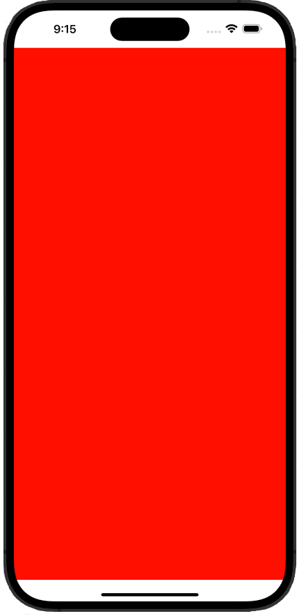
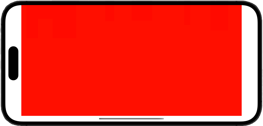
たとえば、以下は iPhone 14 Pro Max のスクリーンショットです。赤いセクションがセーフエリアで、白いセクションはアプリのコンテンツが覆われる場所です。
| Portrait | Landscape |
|---|---|
 |  |
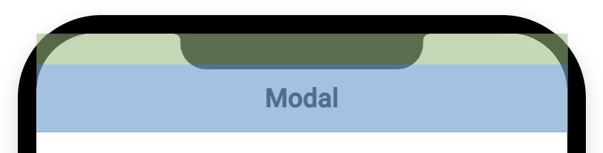
これに対応するため、Ionic は特定のコンポーネントに自動的にパディングを追加します。たとえば、ion-modal内に配置された最初のion-toolbarコンポーネントは、デバイスのセーフエリアの上端に応じてパディングを受け取ります。これにより、デバイスのノッチがヘッダーテキストを覆うことを防ぎます。
このパディングは、アプリケーション変数で説明されている--ion-safe-area-(dir)変数を使用して CSS で手動で調整できます。値はアプリケーション全体、またはコンポーネントごとに設定できます。例:
html {
  --ion-safe-area-left: 25px;
}

ion-modal {
  --ion-safe-area-top: 0;
}